SEC595: Applied Data Science and AI/Machine Learning for Cybersecurity Professionals


Experience SANS training through course previews.
Learn MoreLet us help.
Contact usBecome a member for instant access to our free resources.
Sign UpWe're here to help.
Contact UsPart 1 of 2 Vulnerability Management Metrics

During the webcast nderstand Vulnerability Management Maturity with a Self-Assessment Tool, we covered 5 metrics to start using in your vulnerability management program. They are:
I also covered the various classes of metrics (Operational, Program, Executive, and Contextual) and I discussed adding trending to your metrics. If you missed the webcast, click HERE and you can access the recording.
During the webcast, some questions and comments came in and I was not able to get to all of them within the scheduled time. So here are all the questions asked during the talk, and my answers for them. Some questions have been slightly edited for clarity and expanding some acronyms.
The first question that came in asked: A there any public benchmarks/databases available that show asset coverage across various industry groups?
Unfortunately, no there are not able publicly available benchmarks, like the industry sector breakdowns that you see in the Verizon Data Breach Report, that highlight how various industry groups are doing at asset coverage. It would be great to have this information to know how you are doing compared to your peers, but unfortunately, there isn’t. Some information may be available from some of the larger consulting companies, but you would need to be working with those firms to be able to ask those questions.
what techniques would you recommend that can help us feed the data obtained into the tool (spreadsheet or PowerPoint) that we can use to prepare or present the metrics?
Great question. We have several ways that we can help prepare the metrics. First, some of the metrics are being generated for us by the scanners we are using today, so they are the easiest ones. And for the others, a lot of our data is available within the scanners themselves. We just need to export the data. Now for the simple spreadsheet being used, you will need to export in a CSV format (most likely) from the scanner. This will give you a large amount of data, but to generate the 5 metrics above, you won’t need all of it. So, toss the columns that you don’t need right now and simplify.
Once you have the process mapped out, you should be able to create a macro (in Excel for example) to help automate the steps to import and massage the data to how you need it.
Other tools that can help us visualize and create metrics. Business Intelligence (BI) tools, such as Microsoft’s Power BI, or a SaaS BI offering we demo in the course call Domo, there are both connectors to leverage the scanner APIs, connections to webpages to gather the data, or ingesting the CSV files as well. The BI tools then make it easier for us to manipulate the data, as they give us some visual means to do that. From there, you can create any metrics or reports from the input data.
Finally, there are ITSM tools, for example, ServiceNow, which again can ingest the scanner data, and permit you to create customized reports. These ITSM tools again have connectors to make it easier to connect to our scanners to collect the data, or you can import it from CSV-type files.
Is there a "good" dashboard or other visualization we can use as an example for these 5 items?
I do not have a good example dashboard to direct you to currently. There will be something in webcast 2 that I think you will find helpful, which is directly related to what you are asking however, as an extra, showing how you could pull these all together for useful information. I can, however, give two examples here to show how this information can be displayed that I think will help you out.
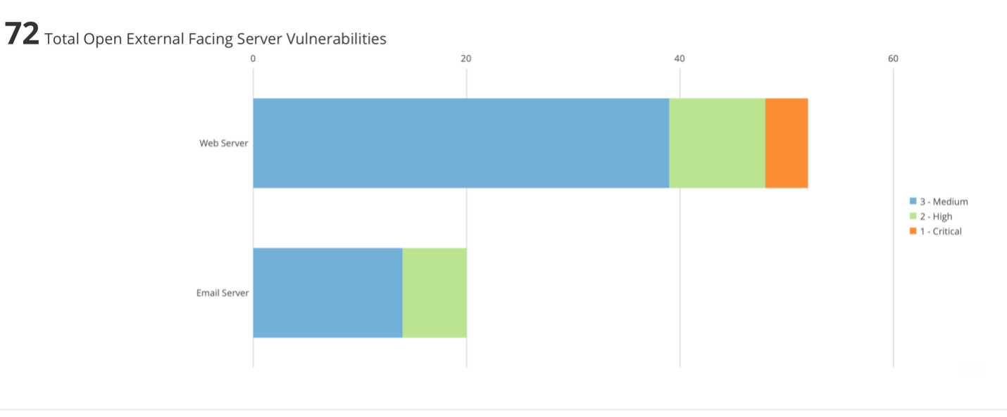
The first is showing the open vulnerabilities. However, it had divided the data up into specific groupings; open vulnerability on external-facing servers. The example below is taken from one of the MGT516 labs (this was created in Domo, a SaaS BI tool). The distinct colors are showing the criticality levels, and the entire graphic is clickable to drill deeper into the information.

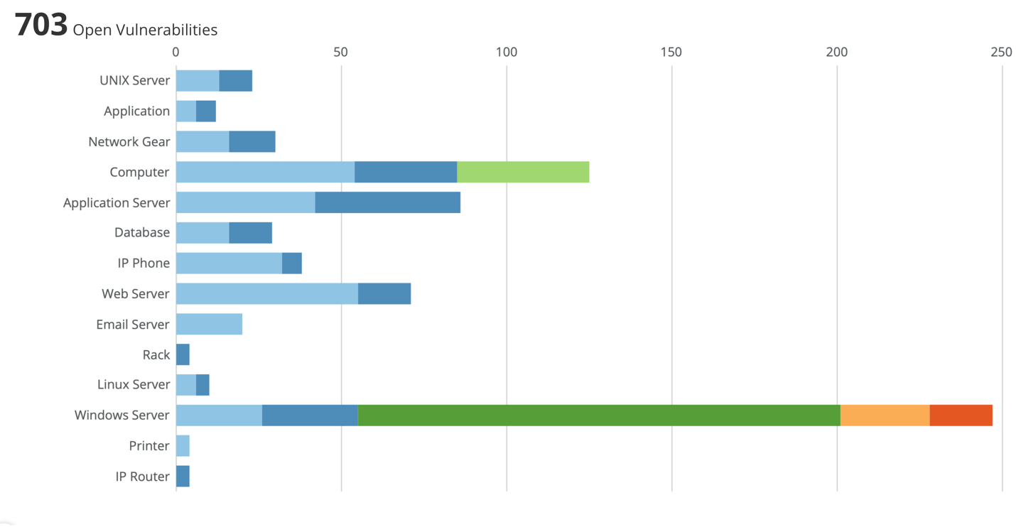
A second example, which again is from the MGT516 class, is showing open vulnerabilities, but we have broken it down by class and owner.

Both are displaying the open vulnerabilities but have taken it a step further and layered in more context to create some meaningful groupings. This second figure’s colors relate to the system owner. But a quick visual here can show so much information.
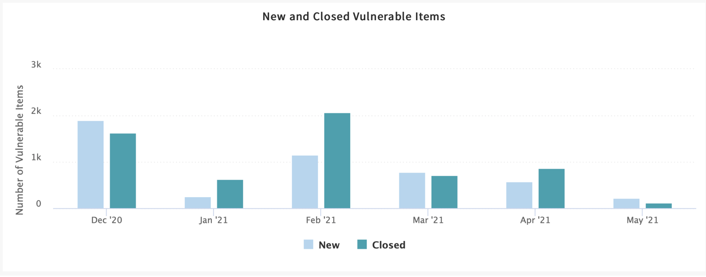
Finally, below is an example taken from my developer instance of ServiceNow. This is showing the new and closed critical vulnerabilities on a per month basis.

Again, this example is layering in more context for us, so we can see the open critical and closed vulnerabilities that we mentioned above.
These are a bit of a sneak peek into the second half of the next webcast, where I will be offering, besides the 3 metrics, additional tips to help present metrics.
Next question: Are tools like Nmap better categorized as controls to validate asset inventory? Nmap could find and flag deviations from what was expected to be there. But your actual inventory should not be based on what you see (machines can be off / protected). The actual inventory is best done in a database/spreadsheet, a manually validated list...
In the webcast, I did mention that you could even use Nmap to help you start to discover the assets within your organization. I completely agree that Nmap is not the best tool to get your asset inventory information from. It will just provide you with details about a system being on or off, and responding, as well as what ports are open. From there, you would need to get further information to confirm software installed and running on the system from tools like WMIC or PowerShell if you have nothing else available. You can also leverage other tools within your environment to get asset information (DHCP, Active Directory, AV systems to name but a few), as they all have some data on the systems that are communicating to them. But none give a complete view. But if you have nothing else, it is a place for you to start.
How to document exclusions that are acceptable because of additional controls - and monitor that those controls are still in place. E.g., a legacy browser that is only able to access internal resources, not the internet.
Compensating controls can help reduce the risk. And by doing that, as you state, the risk may be taken to an acceptable level, and it has been decided that they do not require any further remediation efforts. For me, however, when that decision is taken, I don’t consider them excluded, but an accepted risk.
Regardless of what category you stick them in, you still need to keep tabs on them in my view. And there isn’t an easy way to track those interdependencies between a compensating control and what it is protecting that I know of. The change management process should have this information included in it for when the compensating control was put in place, and we, unfortunately, need to keep track of it and ensure future changes don’t remove it.
Exclusions – time-bound or "specific scenario bound"? E.g., "printing won't work if we install patch". Maybe the app is fixed the week after. That is when we should cancel that exclusion.
If there is a specific blocker, you want to note that as you mention. I still like to use time-bound limits myself instead of scenario/solution required details. For me, in your example, if I knew the printing will break if patched, we need to find out the ETA to get that resolved, and what project/team/group is responsible for that. I would put the time limit there. So, if the resolution time is about 4 weeks out, set a time limit to that point. Then in the 4 weeks, we can revisit it again and see where the solution is at. If it is delayed, there at least needs to be further justified and go back through the process.
The reason I prefer time-bound here is that we need to re-look at the problems regularly with the time limit. If I bind it to the situation, I find they are a lot harder to track. And I can guarantee when 4 weeks will come up. If it is tied to work someone must do, then that is a little more “flexible.” “Oh, we delayed that project due to budget pressures until next year.” But often those decisions are done without thinking of the risk tied to it. And we agreed to wait until that work was done.
And finally, this is a comment more than a question that was submitted. Great presentation. It felt like you know the inside of my organization!
The reason I include this is that there are common problems that a lot of organizations are dealing with. You are not alone in the problems and challenges that you face with vulnerability management. If it was easy to do, we wouldn’t be here discussing it. That’s one of the reasons David and I wrote the MGT516 class. To try and help everyone deliver a holistic vulnerability management program.
If you are interested in the second webcast of this metrics series, please visit
Thanks for stopping by and see you in the second webcast. Feel free to follow me on Twitter at @jonathanristo.
ABOUT THE AUTHOR
With a career spanning over 20 years that has included working in network design, IP telephony, service development, security and project management, Jonathan has a deep technical background that provides a wealth of information he draws upon when teaching. Currently, Jonathan works for the Canadian Government conducting cyber security research in the areas of vulnerability management and automated remediation. He is also an independent security consultant. Learn more about Jonathan here.


With a career spanning 20+ years and has included working in-network design, IP telephony, service development, security and project management, Jonathan has a deep technical background that provides a wealth of knowledge he draws upon when teaching.
Read more about Jonathan Risto